The logo versions you need and how to use them
Define compositions and files so your logo stays clear across different spaces and materials.

Key takeaways
- Choose compositions according to space and context.
- Test minimum size and reproduction on real materials.
- Deliver approved variants to prevent improvised distortions.
A logo that works on a large cover may lose clarity in an avatar, label, or stamp. Preparing variants does not mean inventing another brand: it means adapting the same logo to different conditions. Define a small set of versions and explain when to use each.
Take inventory of real spaces
Note where the logo will appear: website header, avatar, presentation, packaging, and physical assets. Collect their proportions and background conditions. Do not start by producing many versions without knowing what problem each one solves.
Identify the narrowest case, the smallest, and the one with the greatest reproduction difficulty. These limits often reveal whether you need a compact composition, a logo without a descriptor, or a monochrome solution.
Define a family of compositions
A horizontal version can serve headers; a compact version can work in areas closer to a square. If a symbol can identify the brand on its own, document the contexts in which it can be used without the name.
Do not automatically shrink the whole logo until it fits. If the descriptor becomes unreadable, consider an approved variant that omits it where the context allows. Maintain relationships of form and proportion between versions.
Prepare color and single-ink versions
Check the logo on light and dark backgrounds and intended materials. A monochrome version needs to be reviewed as a drawing: details that depend on color differences may merge or disappear.
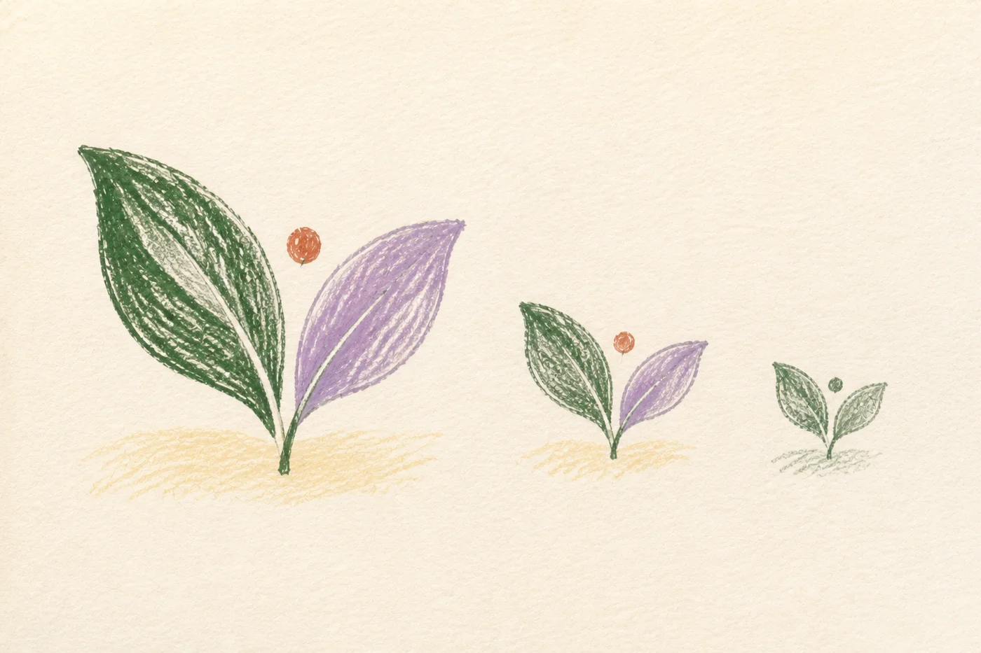
Hypothetical example: a two-leaf symbol can be preserved in one ink if the space between the leaves remains clear. On a small label, that space may need a designed and approved adaptation, not an improvised correction by the printer.
| Condition | Possible variant | What to review |
|---|---|---|
| Horizontal space | Horizontal logo | Name and spacing |
| Compact area | Compact composition | Internal hierarchy |
| Very small size | Authorized symbol | Contextual recognition |
| One ink | Monochrome version | Detail and internal spaces |
Test clear space and minimum size
Define an internal reference to maintain separation from other elements. Then test the logo with text, borders, and photographs. Clear space should prevent interference and make sense in real applications.
Progressively reduce the logo on screen and produce physical samples where appropriate. Observe when the name becomes unreadable or details close up. Record limits by version and medium instead of publishing one size as though it covered every use.
Deliver files and decisions together
Name variants by composition, color, and use. Include previews and a selection guide. Explain which file someone needs to place the logo and which is retained as the editable original.
Add examples of frequent problems: distortion, an unsuitable background, or the wrong version. Accompany each problem with an approved alternative. The guide should help resolve a situation, not merely point out that it is wrong.
Complete the versions you actually need
- Gather the spaces and materials where your logo will appear.
- Test compositions, single-ink reproduction, and small sizes.
- Deliver files with a selection guide and usage examples.
Frequently asked questions
Can I use just the symbol?
When there is an approved version and the context allows the brand to be identified. Do not assume a new audience will recognize a symbol without the name.
Does every brand need many variants?
No. Prepare those needed for real uses. A small, well-tested set is easier to maintain than many similar compositions without clear criteria.
Is the minimum size the same on screen and in print?
It is best not to assume so. Reproduction depends on the medium, technique, and detail of each variant. Test and document specific conditions.