How to choose typefaces that work beyond the logo
Test type families with real content, small sizes, and the characters your brand needs.
Key takeaways
- Test the family with the languages and characters you will actually use.
- Assign roles for headings, reading, and data.
- Check availability and terms of use before integrating the files.
A brand's typography has to solve more than an attractive heading. It must work with long names, paragraphs, prices, accents, and files other people will edit. Evaluate families using real content and defined roles before choosing a pairing based on its appearance in a sample.
Define typographic tasks before searching for families
List the uses: campaign headings, article reading, small labels, presentations, and figures. Note where personality is needed and where clarity comes first. One family can serve several functions through weights and sizes.
If you choose two families, explain the role of each. You do not need a second one just to make the pairing look designed. The difference should help organize content and be maintained in the assets the team produces.
Prepare a test sheet with real content
Include the brand name, a long heading, a paragraph, numbers, and language-specific characters. For Spanish, check ñ, accents, opening punctuation, and recurring catalog words. Add small sizes and commonly used backgrounds.
Compare candidates in the same layout. This lets you observe width, rhythm, apparent height, and character differentiation without a different design artificially favoring one option. The sheet should include the difficult case, not just a word that looks good.
Evaluate hierarchy and reading together
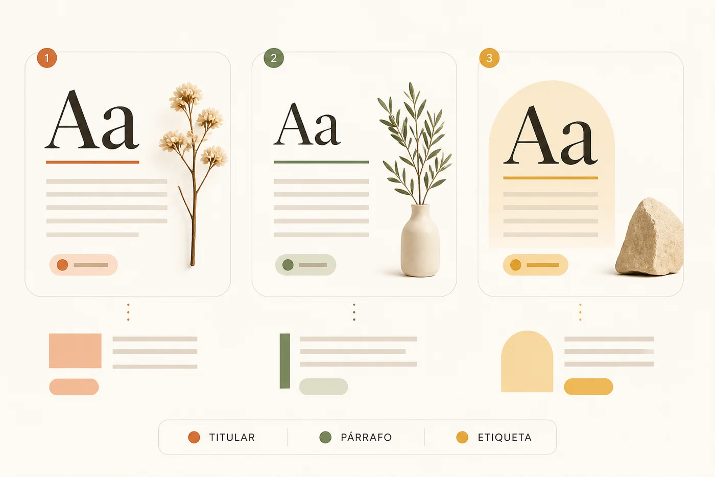
Check that headings, subheadings, and body text are distinct without relying on too many weights. Review line length, line spacing, and paragraph spacing. A readable family can perform poorly in an overly cramped layout.
For data, compare numerals and alignment in an actual table. For a label, print it at the intended size. Do not evaluate everything enlarged on screen: the decision must hold up where people will read the content.
| Sample | What to observe | Where to check |
|---|---|---|
| Long heading | Width and line breaks | Page and presentation |
| Paragraph | Rhythm and spacing | Reading at actual size |
| Figures and table | Differentiation and alignment | Working document |
| Language-specific characters | Coverage and form | Final content |
Check availability and terms of use
Consult the distributor's information for the intended uses, such as websites, documents, or physical production. Save the source and applicable terms. Do not distribute font files assuming any download can be shared in any way.
Also review the working environment. A presentation may change appearance if someone else does not have the family available. Define a system fallback or suitable delivery method, and check the document on the receiving computer.
Document a short scale with examples
Record families, weights, roles, and size examples by channel. Include a long heading, reading text, and a table. Explain what to do when text does not fit: edit, reorganize, or use another layout before shrinking it without limit.
Keep an approved asset as a reference. When a family or weight changes, review line breaks, button heights, and existing documents. Typography affects structure; it is not a purely decorative replacement.
Compare candidates with the same test
- Define roles and collect real text, including the hardest examples.
- Compare a few families on an identical sheet and at actual usage sizes.
- Check terms, handoff, and a fallback for environments without the family.
Frequently asked questions
Do I need one typeface for headings and another for body text?
Not necessarily. A family with enough resources can serve several functions. Add another when it provides a useful difference and you can maintain it across the necessary channels.
What should I do if a heading does not fit?
Review wording and layout first. Reducing the size can be part of the solution, but it should not destroy hierarchy or readability.
Can I give the fonts to any supplier?
Check the distributor's terms and intended use. When sharing the files is not permitted, explain how to obtain them or prepare an allowed handoff.