How to define art direction for photos and illustrations
Document framing, lighting, texture, and treatment so your images belong to the same brand.

Key takeaways
- Describe observable visual decisions.
- Separate the subject from technique and treatment.
- Test the same rule across different scenes before turning it into a system.
Art direction connects images that show different things. It defines how the brand's world is seen: where the frame is placed, how light enters, and which materials appear. These decisions make it possible to produce new photos or illustrations without relying on copying an earlier image.
Connect the image to the brand's intent
Revisit what you want someone to understand or perceive, and translate it into visible decisions. If showing craftsmanship matters, you may need process details and materials. If helping someone choose matters, clear comparisons may be more useful.
Avoid making broad adjectives such as premium or creative the entire direction. Explain what they mean for framing, lighting, texture, and the relationship between objects. That way, someone producing images can act without guessing.
Define framing, light, and material as constants
Choose a few repeatable rules: a camera height, a lighting approach, compatible backgrounds, or a level of detail. Also specify how much context to show and which elements must remain recognizable when cropped.
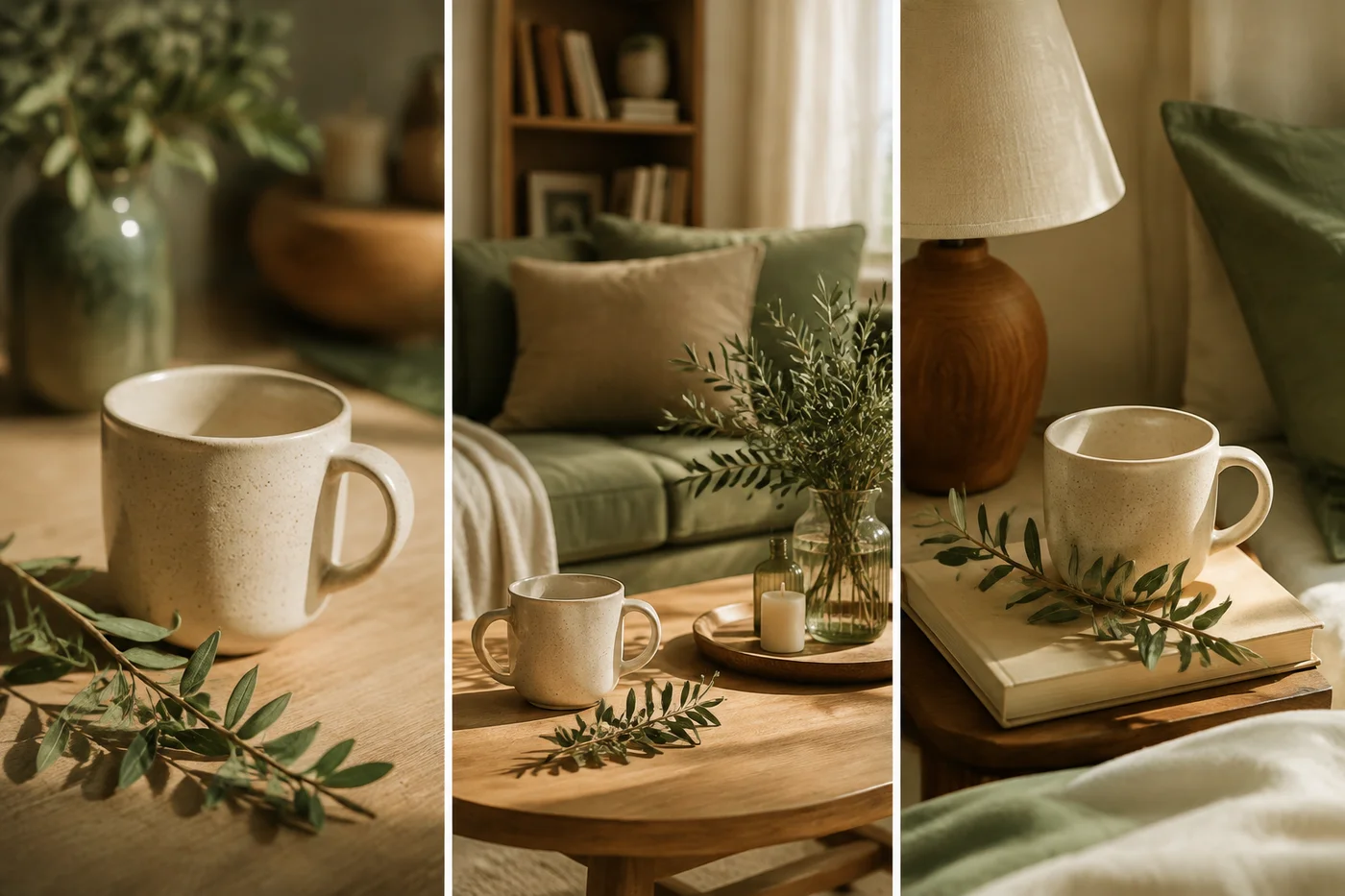
Hypothetical example: a mug and a branch can be photographed in a wide view, close-up, and in use while maintaining soft side lighting and natural materials. The three images relate without repeating the same composition. That continuity is more flexible than always requiring the same background.
Use references with specific annotations
Select references for specific decisions and write down what to observe in each one. One may show paper texture and another the scale relationship between an object and its surroundings. Explain what is not part of the reference, such as its subject or brands.
When generating images with AI, make that separation clear. A style prompt may contain an original scene; if you do not distinguish it from the new request, the result may repeat objects unrelated to your article or product.
| Decision | Example rule | Review question |
|---|---|---|
| Framing | Show the object with enough context | Are scale and use understandable? |
| Light | Soft shadows and recognizable materials | Is the relevant detail preserved? |
| Texture | Consistent treatment across the series | Does it look like part of the same family? |
| Cropping | Preserve the main subject | Does it work in its actual destination? |
Build a small test series
Apply the direction to scenes with different needs: an object, a person, and a concept, if your brand uses all three. Review whether the rules create continuity or only work for a very specific still life.
Place the images in their actual applications. A composition may work on a horizontal cover and fail in a narrow card. Prepare alternative compositions when the channel requires them, and keep the main subject within the crop.
Document selection, editing, and uses
Save approved examples with notes about lighting, framing, and treatment. Define which editing adjustments are allowed and which transformations change the product's appearance too much. Art direction should not alter information that matters to a choice.
Add alternative text according to the image's function. W3C distinguishes informative, decorative, and other image functions; they do not all need the same description. In a conceptual series, also explain the context so it is not mistaken for documentation of a real product.
Define and test your art direction
- Write four visual decisions and annotate references by function.
- Produce a series with different subjects and compare it in real applications.
- Save approved examples and rules for adaptation and description.
Frequently asked questions
Can I combine photography and illustration?
Yes, if you define the function of each medium and the decisions that connect them. Test how they work together in a real asset before approving styles separately.
Do all images have to use brand colors?
Not as a mandatory filter. Preserve natural colors when they are necessary to understand materials or products. The connection can appear in backgrounds, details, or composition.
How many references should I save?
Enough to explain distinct decisions without contradictions. A few annotated references usually offer better guidance than a large folder without context.