How to translate your brand into a clear homepage
Prioritize message, evidence, and flow so a new visitor understands what you offer.

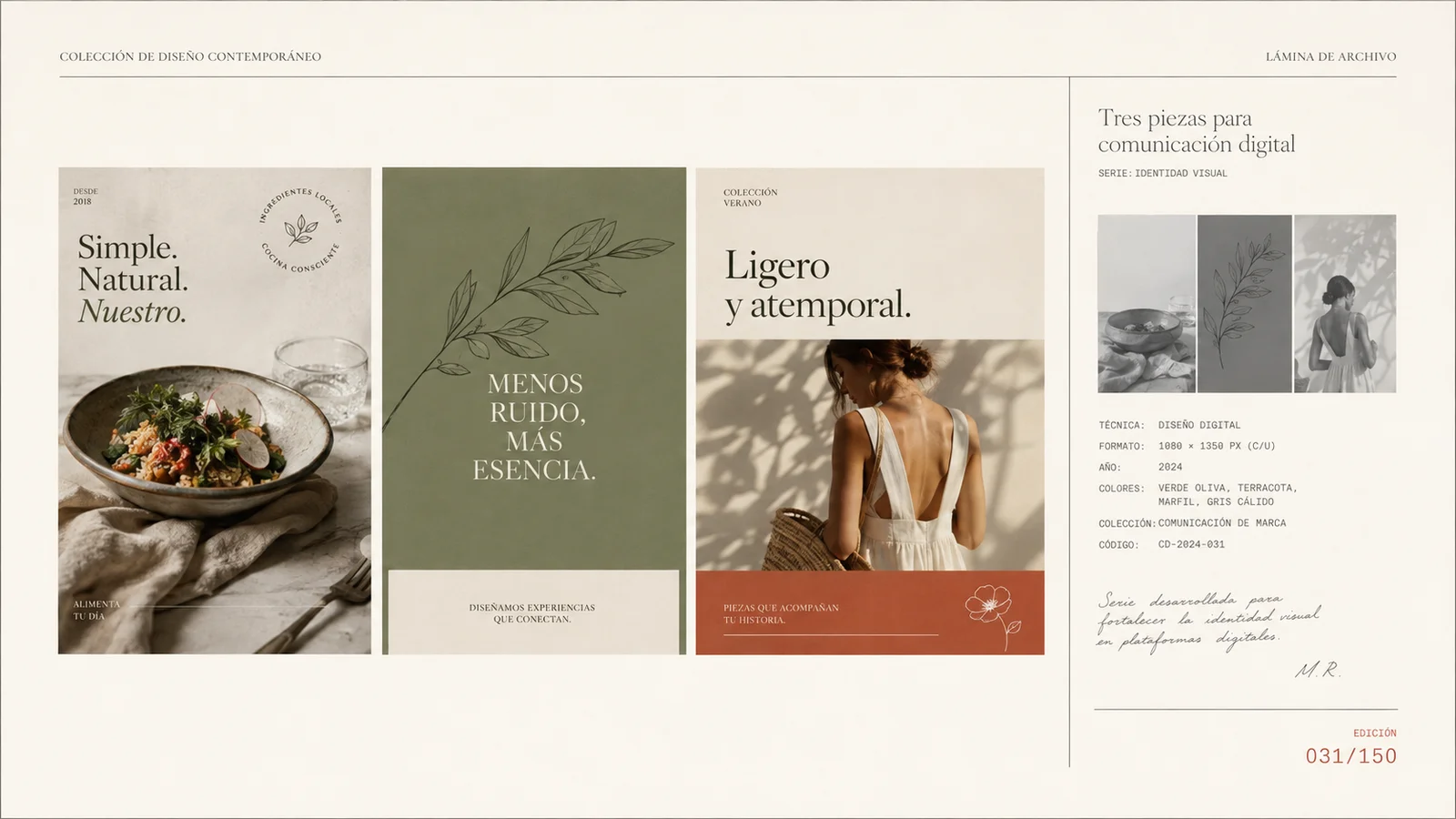
Fictional visual example. Names, dates, and record cards are part of the illustrative composition.
Key takeaways
- Make the offer, audience, and next step understandable from the start.
- Place evidence near the promise it supports.
- Review the journey on mobile and with people outside the project.
The homepage needs to guide someone who does not yet know your business. Visual identity helps them recognize it, but the message and flow must explain what you offer and where to continue. Design that first conversation with concrete information before filling the page with sections.
Write the proposition before choosing the main image
Describe what you offer, for whom, and in what situation it is useful. The heading can focus the idea, while the following paragraph adds precision. Avoid phrases that could belong to any business, such as “we take your dreams further.”
Hypothetical example: a workshop that prepares gift sets can show the complete set and explain how to confirm a selection. An image of an isolated mug might be attractive, but it does not communicate the gift-set offer on its own.
Order the page like a conversation
After presenting the proposition, answer reasonable questions: what is included, how it works, and what evidence exists. The sequence depends on the visitor's decision. Do not add a section only because another page has one.
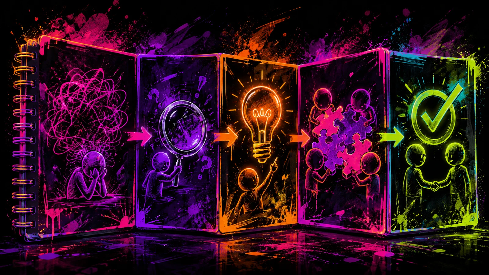
Sketch the journey on cards and write the question each one answers. If two blocks say the same thing in different words, combine or remove them. If an action appears before its consequence is understood, add context.
Assign a function to each piece of visual evidence
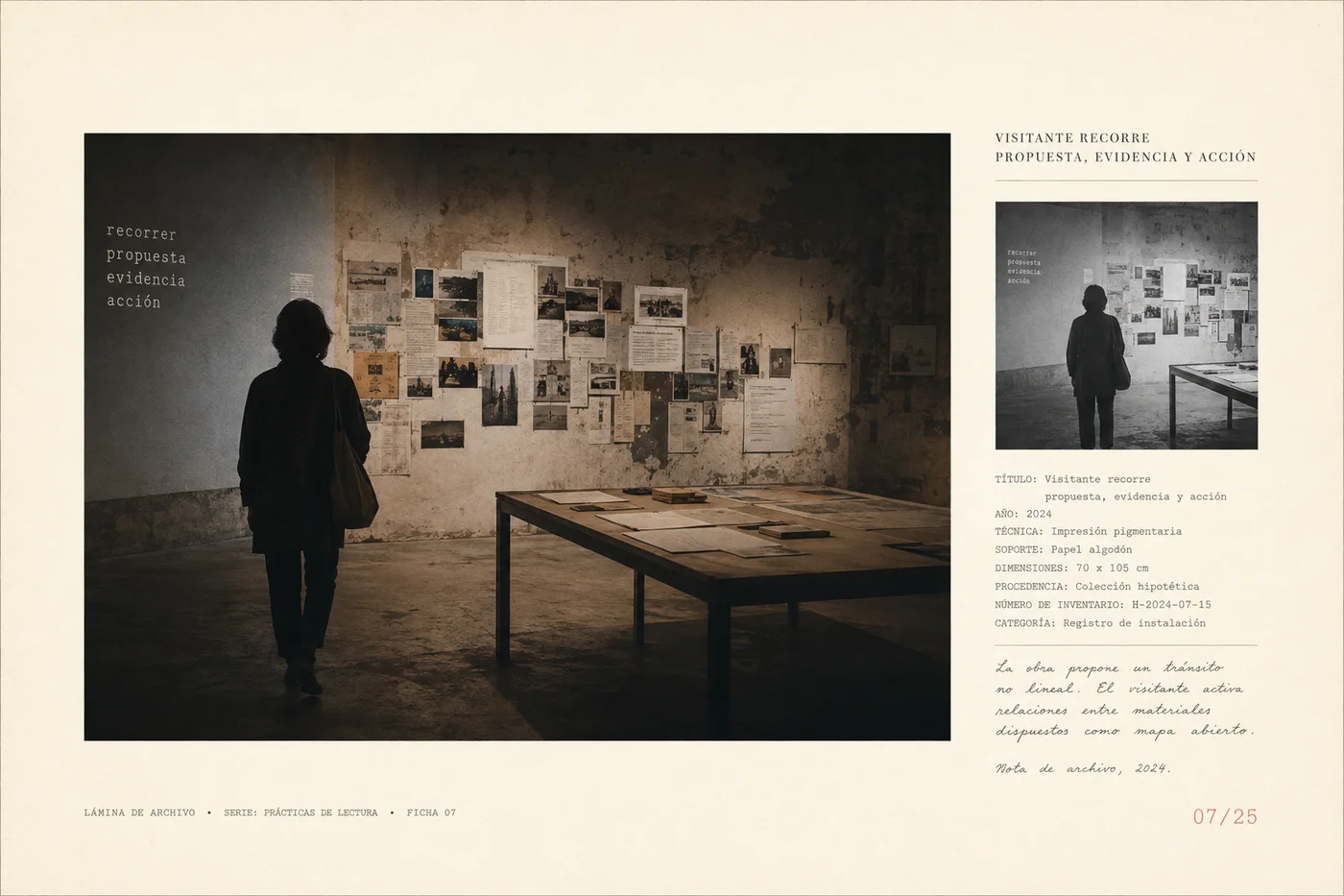
A photograph can show a product; a detail can explain a material; an example can demonstrate how a service applies. Place evidence beside the message it supports and add a caption when context is needed.
Do not present conceptual images as real client cases. If you do not yet have evidence for a promise, change the promise or explain the process you can demonstrate. Decoration does not make up for missing information.
| Visitor's question | Possible block | Check |
|---|---|---|
| What do you offer? | Heading and context | They can summarize the offer |
| What would it be like for me? | Application or process | They recognize their own situation |
| What supports it? | Relevant evidence | They understand what it demonstrates |
| Where do I go next? | Action with a clear destination | They reach the next step |
Make navigation and actions predictable
Name links after their destinations and buttons after the actions they enable. “View sets” signals a catalog better than a generic word. Keep access to information commonly needed for a decision, such as scope, process, or contact details.
Check that a card leads to the content it advertises and that categories group items understandably. Clear navigation also requires real destinations: avoid empty links and pages promising information they do not yet contain.
Check the journey with real content
On mobile, review long headings, image crops, menus, and actions. Test the page with a keyboard and check that focus is visible. Then ask someone new to explain the offer and find a specific task.
Record comprehension questions separately from navigation errors. If the proposition is not understood, review the content; if it is understood but people cannot find where to act, review hierarchy or navigation. This enables precise changes instead of redesigning everything.
Audit the first journey through your page
- Write the offer, audience, and main action without looking at the design.
- Connect each section to a question and a piece of evidence.
- Perform one task on mobile and another with a keyboard, then fix the obstacles.
Frequently asked questions
Does everything have to fit on the first screen?
No. The first screen should orient visitors and give them a clear reason to continue. The rest can develop evidence, process, and details in an understandable order.
How many actions can I show?
Prioritize one main action per context. You can offer alternatives when they serve different needs, taking care not to give them all equal weight.
Can I use generated illustrations?
Yes, for concepts or scenes presented as such. Do not use them as evidence of real clients, products, or results they do not represent.