How to bring your identity to readable, recognizable packaging
Organize the front, check real-world use, and prepare a useful conversation with your supplier.
Key takeaways
- Order information around what people need to recognize.
- Test the assembled design, in the hand and at actual size.
- Confirm materials and specifications with the supplier before finalizing files.
Packaging has to work as an object as well as look good in an image. It must guide, identify, and support use of the product. This guide focuses on organizing the identity and preparing physical tests; technical and labeling requirements must be reviewed for the specific product and market.
Define the context and main information
Describe where people will encounter the product: in a shipment, on a display table, or in a gift set. Identify which face is seen first and what the person needs to understand. The brand should not displace information that helps identify the contents.
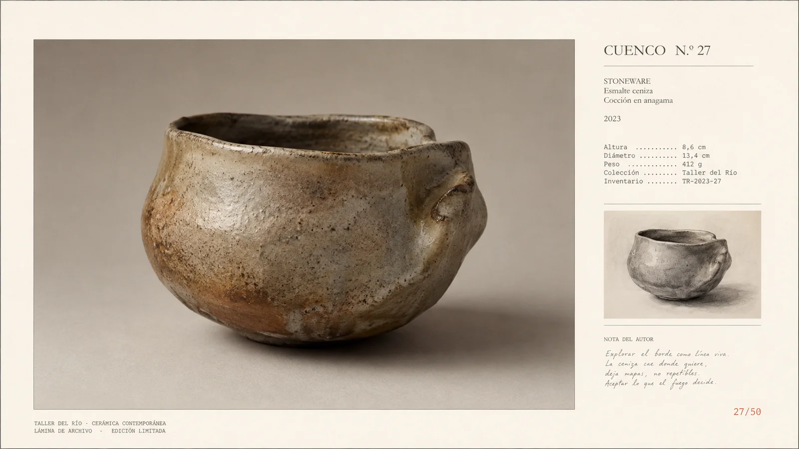
Hypothetical example: a box for a ceramic piece can show the object type on the front and reserve another face for care instructions and contact details. Organize the information before choosing decorative finishes.
Build a hierarchy that works in three dimensions
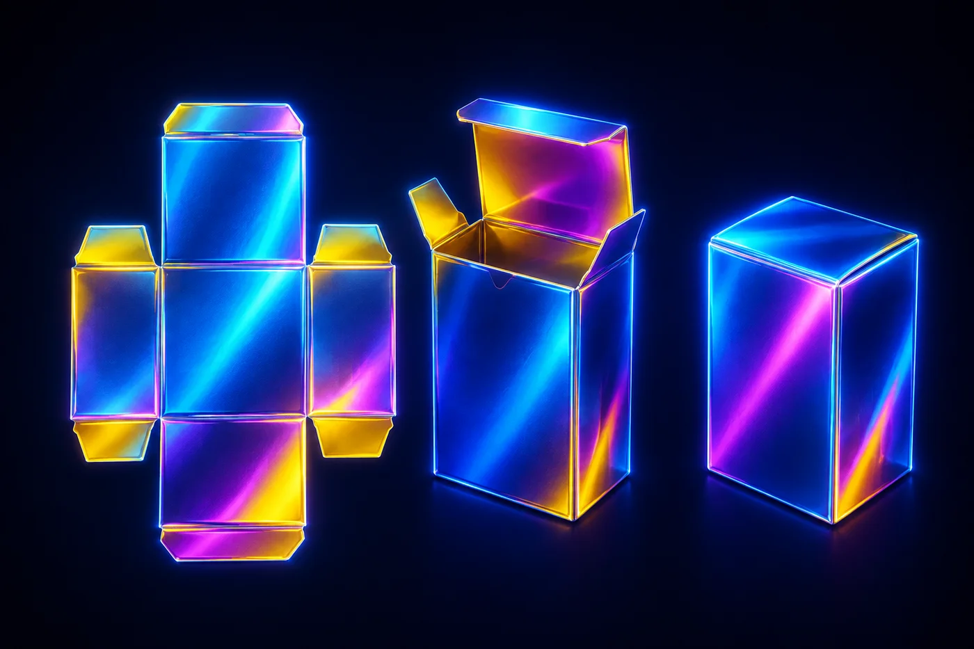
Sketch the main faces and assign a function to each. Consider seams, folds, and areas that will be covered. An element centered in the flat file may end up poorly positioned when the packaging is assembled.
Make a simple paper mockup at the intended size. Place the information and observe what is readable from different angles. This test does not replace a sample in the final material, but it helps uncover structural problems early.
Apply the identity thoughtfully to the material
Check the logo, color, and typography on the substrate you will use. A background that looks white on screen may be cream, translucent, or textured in production. Ask the supplier for a proof appropriate to the agreed technique.
Do not add finishes just because they are available. Ask what they contribute to recognition, reading, or use. If a special ink makes small repeat batches difficult, document an alternative that preserves the identity.
| Test | Allows you to review | Does not confirm on its own |
|---|---|---|
| Flat file | Hierarchy and layout on each face | Readability when assembled |
| Paper mockup | Folds, orientation, and opening | Final material color |
| Supplier sample | Agreed production result | Every context of use |
Review the opening and use experience
Assemble the packaging with the product or a representative sample. Check whether it opens without confusing instructions, whether the pieces are oriented correctly, and whether care information remains available after removing a band or label.
Observe someone who has not seen the design. Avoid explaining how to open it beforehand. Their questions may reveal friction that a front view of a digital mockup does not show.
Finalize files together with production conditions
Confirm the dieline, bleed, safe areas, inks, and delivery format with the supplier who will actually produce the piece. Keep the approved proof and its associated file version. Do not treat generic measurements as suitable for every process.
Before approval, review the mandatory content for the product and destination with the responsible person. This visual guide does not define that content. Finalize the identity when information, structure, and production are aligned.
Prepare a packaging review
- Organize the information and functions of each face.
- Assemble a full-size mockup and observe someone opening it.
- Confirm specifications and save the approved proof with the final file.
Frequently asked questions
Can I design before I have the dieline?
You can explore direction and information, but the final layout must fit the confirmed dieline. Do not finalize production using an approximate shape.
Do I have to use every brand color?
No. Choose the ones that serve a function in that piece and work with the material. Consistency depends on relationships and uses, not including the whole palette.
Is a realistic image enough for approval?
No. It can communicate appearance, but it does not confirm opening, strength, color reproduction, or manufacturing conditions.