How to bring your brand to social media without repeating the same template
Design a family of posts that maintains identity while allowing different kinds of content.
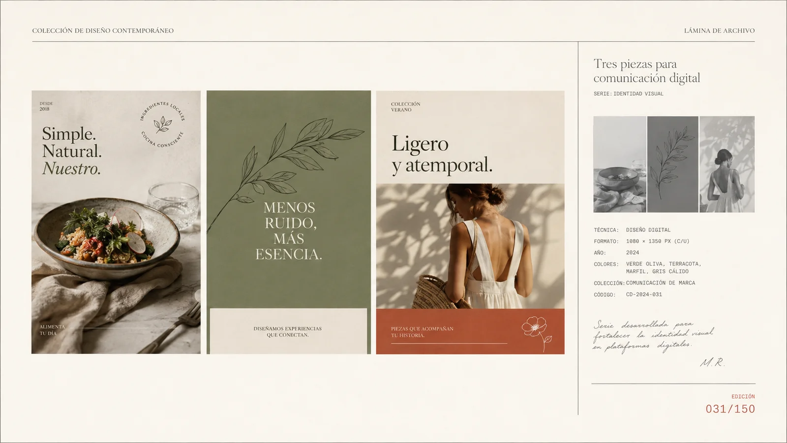
Fictional visual example. Names, dates, and record cards are part of the illustrative composition.
Key takeaways
- Organize posts by editorial function.
- Keep recognition cues while varying composition and scale.
- Check each asset on a phone before publishing.
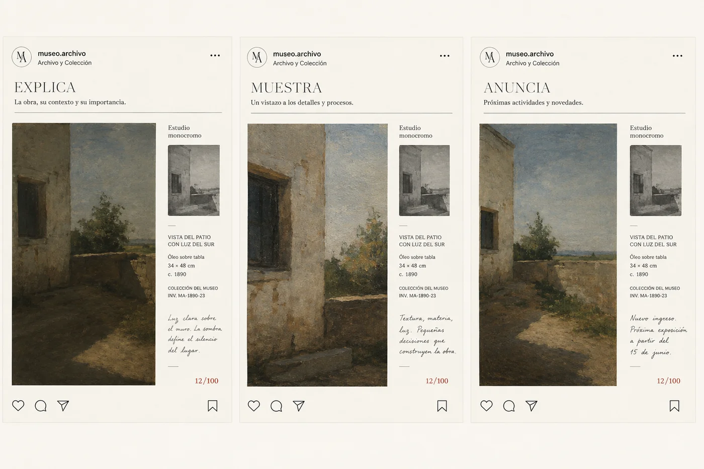
A recognizable identity does not require posting the same layout every day. It needs rules that survive different messages: an explanation, a work sample, or an announcement. Design a family of formats around the content's function and give each asset the space it needs.
Define the types of content you need
Collect posts you actually want to produce and classify them by job: explaining a decision, showing a result, or announcing something. Do not start with a decorative grid. The layout should respond to the content that will go inside it.
Hypothetical example: an interior design studio can show a material detail, explain why it was chosen, and announce a workshop visit. These are three different functions even if they belong to the same week and share a visual direction.
Choose constants that make the brand recognizable
Maintain a type family, a color relationship, a framing approach, and a consistent logo position when needed. They do not all have to appear with identical emphasis in every asset.
Let the image occupy more space when it provides evidence, and let text lead when the idea requires it. A shared grid can support both options. Check the family together and each post on its own, because many people will see only one.
Design formats with content limits
A useful template indicates how much text it can accommodate and what to do when that limit is exceeded. If a long heading forces the type to shrink until it is unreadable, the format needs another layout or an edited message.
Create a real example of each function with short and long text. Include safe margins around important information and review the channel's crop before exporting. Specifications change; confirm those of the destination when preparing the asset.
| Function | Main element | Support |
|---|---|---|
| Explain | An idea and an example | Diagram or detail |
| Show | A relevant image | Context and reasoning |
| Announce | The information that changes | Date or action when appropriate |
Connect image, text, and next step
Avoid a description that repeats the image's words verbatim. Use it to add context, explain the decision, or show where to learn more. If there is an action, offer one that makes sense after that content.
When showing a project, identify which part is finished and which is a proposal. Label conceptual examples as such. A generated image or mockup can support exploration, but it should not become evidence of delivered work that does not exist.
Review clarity and continuity before publishing
Open the asset at phone size and check the heading, main detail, and logo. Also review the sequence when there are multiple slides: each should have a function and lead clearly to the next.
Record template usage problems: headings that do not fit, images that lose their subject, or information that is always missing. Adjust the system based on those cases. Consistency improves when the rules respond to real work.
Build your first family of posts
- Choose one asset to explain, another to show, and another to announce.
- Apply shared constants and test text of different lengths.
- Review them on a phone and document when to use each format.
Frequently asked questions
Does every post need a logo?
It depends on the context and the need for identification. If you include it, preserve readability and space. It should not compete with the main message.
How do I keep the account from looking repetitive?
Vary scale, composition, and content type within shared rules. Changing the entire visual language in each asset makes the brand difficult to recognize.
How many templates should I create?
Start with the functions you produce regularly. Add another when a need emerges that the existing ones cannot clearly address.