How to tell whether a visual trend suits your brand
Evaluate a trend for usefulness, coherence, and maintenance cost before adopting it.
Key takeaways
- Describe the specific visual element before judging its popularity.
- Evaluate usefulness, coherence, and maintenance in real applications.
- Test a limited addition before changing the entire identity.
Seeing a visual element repeated across many references can make you want to adopt it immediately. Before changing your identity, ask what it would solve for your brand. This article proposes an evaluation method; it is not a list of this year's trends or a prediction of what will succeed.
Separate the visual element from the promise surrounding it
A trend may bring together different techniques under one label. Identify what actually interests you: a texture, a typographic scale, a material, or a way of composing. Then explain what it could contribute to a brand task.
Avoid using its presence in references as proof of effectiveness. An image may circulate because it is surprising, while your asset needs to help people read or compare. Popularity and usefulness are different questions requiring different evidence.
Compare the element with your brand constants
Review which elements make your identity recognizable and which allow variation. A new treatment can coexist with familiar typography and hierarchy. If it requires changing everything, you may be evaluating a new brand direction rather than a small campaign element.
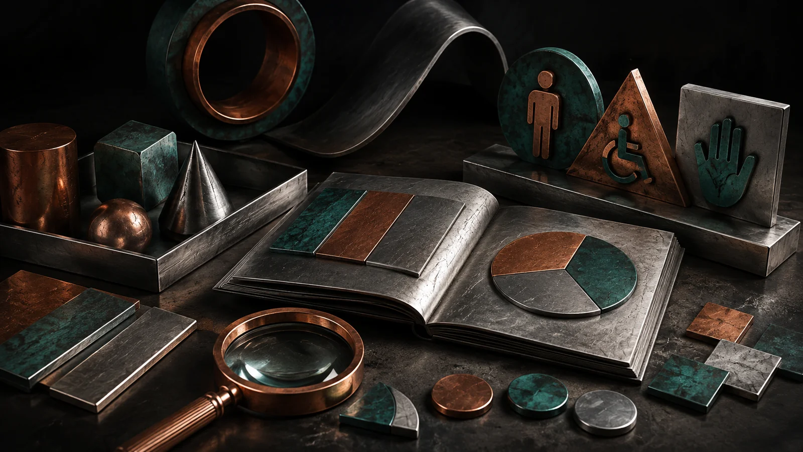
Hypothetical example: an object brand uses a metallic texture in a campaign. It can test it in an illustration while keeping the name, margins, and tone. Adopting it in the logo, packaging, and navigation at the same time would make it difficult to evaluate what each change contributes.

Evaluate an asset by its function
Prepare one version with the element and another with the usual direction, using the same content. Compare understanding, readability, and recognition. Do not make one version deliberately weak to justify the new one.
Observe the asset at its usage size and alongside other brand assets. An effect may work on a large cover and lose its purpose in a thumbnail. Record the conditions in which it helps and those in which it needs an alternative.
| Criterion | Question | Useful evidence |
|---|---|---|
| Usefulness | What task does it improve? | A test with real content |
| Coherence | What preserves recognition? | Comparison with the current family |
| Adaptation | Does it work in difficult formats? | Small and long versions |
| Maintenance | Can we produce it again? | Available process and files |
Estimate the effort needed to maintain the decision
Ask who will produce new assets, which files they need, and what happens when the element must be adapted. Consider languages, sizes, printing, and editing by collaborators. The cost of maintaining a decision includes time and dependence on specific skills.
If only one person can recreate the effect, document the process and prepare a simple solution for everyday cases. An identity should not grind to a halt because an exceptional asset is difficult to repeat.
Decide the scope and when to review it
You can adopt the element for a campaign, reserve it for certain topics, or reject it. Write down the reason and the condition for reviewing it. You do not need to turn every attractive exploration into a permanent rule.
Evaluate the result against the initial question: if you wanted to explain a difference, check understanding; if you wanted to expand variety, review the series' coherence. Avoid attributing every commercial change to design without considering other factors.
Evaluate a trend with a small test
- Name the element and the task you expect it to improve.
- Compare two equivalent assets and review their difficult formats.
- Define scope, ownership, and a criterion for keeping or removing it.
Frequently asked questions
Does a brand have to follow trends to look current?
Not necessarily. It can stay relevant by improving clarity, content, and applications. Adopting new elements makes sense when they support its purpose and audience.
How do I distinguish a trend from a passing fad?
You cannot always predict its duration. Evaluate whether the element remains useful beyond its novelty and limit its scope when there is uncertainty.
Should I redesign if my team is tired of the current look?
Internal fatigue does not prove there is a problem for the audience. Look for signals of understanding, recognition, and use before changing the system.